Charting like a Pro!
- Dec 16, 2017
- 5 min read

I had finished writing today’s post a few days's back. It was ready to go live.
Today morning when I got up, I deleted all of it.
A thought was bothering me, I am writing this blog for you, someone who knows very little about this topic and so I changed it completely to make it very simple.
What you are about to learn today is one of the core skills a trader must have. Reading a chart. Since it’s something very important to be a successful trader, I must ensure that you understand it really well.
Read this post slowly right to the end. Even if it may seem like an effort, it is a one-time effort.
I promise you that if you read this today with concentration once, you’ll be able to understand most of the charts you’ll ever come across and understand every other post I make with ease.
Let’s get right to it. It’s really simple, I promise.
The stock markets open for trading every weekday at 9.15 in the morning and close at 3.30 in the afternoon.
During these 6 hours, millions of people all over India and even some from outside India come online and offer various prices for buying and selling stocks.
It’s like a vegetable market, different sellers offer different prices and different buyers bargain and agree to different prices.
A sale is completed when a seller and buyer agree to a price, some buyers may buy at Rs. 20 a kg without bargaining, someone will bargain and get it for Rs. 15, someone may look well off, so the seller will sell at Rs. 25.
During the day, the same vegetable sells for different prices.
The same thing happens to stocks. During a single day, a stock will be bought and sold at different prices. Almost every single second a sale is being completed because unlike the vegetable market the buyers and sellers use computers.
There are 21,600 seconds in those 6 trading hours and so there could be those many different prices of a stock in a single day! This causes stock prices to be very volatile (fluctuate often).
Each one of these prices matter us because they can show us trends.
I promised you we will look at very few numbers.
So to analyze these various prices we will use something we all learnt in school, graphs or charts.
There are many types of graphs, the simplest one we all probably know is the line graph. Here’s an example:

A line graph simply connects all the closing prices of a stock with a line.
It’s really simple, but there’s a huge problem with it.
Visualize this,
A stock may have closed yesterday on 15th December at Rs. 250.
Today on 16th December, at 9.15am when trading started it opened at 280, the price then rose further to 300 and began falling to 220 but finally at 3.30 when markets closed it was at Rs. 250.
Now if I asked you to draw a line chart of the closing prices, you would just draw a straight line because both yesterday and today the stock closed at 250.
It just simply doesn't give us enough information! It gave us no indication of the price fluctuations (the volatility) which ranged from the low of 220 and a high of 300.
To address the problem, a Japanese guy named Munehisa Homma came up with an amazing idea which I am about explain, it is called the candlestick chart.
Before I explain, remember in trading charts we have prices on our right and on the bottom of the graph we have time.
I will use the same stock from the example above.
First, wee draw a small bar at that opening price, in our example that is Rs. 280:

Got it?
One important but simple rule you must keep in mind:
If price is above the open price we draw in green
If price is below the open price we draw in red.
We use a colour so that in a glance we can know if the current price is below or above the open price.
Now, continuing with our example, The price rises to 300.
We connect to open to the current price with a box.
300 is above the open Rs. 280 so we draw a green box from the open to Rs. 300.

With me so far? Good.
After that price fell to Rs. 220.
Now again, we need to connect the open to the current price. Since Rs.220 is below the open price of Rs. 280, we draw in red.
We will draw a red box from the open down up to the price of Rs. 220.
But we need something to mark that the stock price was for some time at Rs. 300. So we use fine line to indicate the price was at Rs. 300. This is called the ‘wick’.

I suppose by now you have got a little idea of how this is better than a simple line graph, we can see the high price in addition to the open and the current price and open price.
Let’s keep going,
The price now rises and comes back to Rs. 250, open and close are again the same.
Like we left a thin line (wick) at the top, we will do the same below up to the lowest price of Rs. 220. So we have two wicks one above and one below.
But now we are at the open again, so we can’t use a red candle or a green candle. So we just leave it grey.

That’s it!!
You learnt candlestick charts!!
Lets’ take two more examples to ensure you got it, I will not show the steps just the final answer, so just try and visualise before you see the answer.
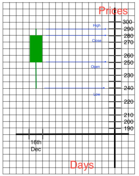
Example 1:
Stock open price 250
Low of the day Rs. 240
High of the day Rs. 290
Close of the day Rs. 280
Ready for the answer? Have a look:
The candlestick is green because close is higher than open. Lower wick is till the low and upper wick is till the high.
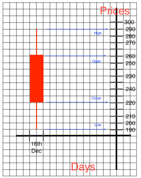
Another example:
Stock open 260.
Stock close 220.
Stock high 290
Stock low 190
Ready for the answer?
Here we have red candle because close price is lower than the open.
Lower wick at the day’s low and upper wick at the day’s high.
If you understood the examples, you have learnt everything I was going to show you today!
Here’s a quick summary:

Aren’t candlesticks just wonderful!
You get the OHLC in one glance. OHLC? That’s the Open, High, Low, Close! So much information is a small graph!
There is one last thing to discuss, I have explained candlestick charts to you on a daily time frame. Now imagine if we wanted to see data for an hour or a minutes, a candlestick chart will give you the OHLC of each hour or minute as well.
Here are some examples of candlestick charts in various time frames...
Before you proceed, I want to congratulate you!
Today, you took the first step towards becoming a professional trader!
If you understood this post, you will never forget it and you will use it lot now onward!
I tried to keep this as simple as I could.
You may still have some doubts so I found a video which would definitely help you understand charts better. Click here to watch it or download it. (Click skip advertisement on the upper right)
I’d love to hear from you, please give me your feedback here in the contact section! I’ll be happy to address any questions! Subscribe and follow to get the latest updates!
Oh and tell your friends about the blog! Sharing is caring!
We are one post away from your first strategy! So stay tuned...
See you at the next post!
PS:
You might want to know where can you see these charts?
Step 1: Go over to moneycontrol.com
Step 2: Go to any stock by using search bar at the top, maybe Infosys or Reliance.
Step 3: Scroll down and you should see the words "Technical Chart”. Click on it.
And you should have reached your candlestick chart. Now play around and explore the options. Try the various time frames. Explore.
If you already have a broker account who provides you with a trading platform, search for any stock and in the chart settings select candlestick chart.


Comments